
Image Recognition Mobile App for Museum-Goers
Enhancing the in-museum art viewing experience through image recognition
TIMELINE: 5 days
ROLE: Solo Project for Springboard's UI/UX Bootcamp
I chose the GalleryPal challenge by Bitesize UX for my Design Sprint project. The Design Sprint project aims to give students the experience of working through a modified version of Google Ventures Design Sprint. It is a five-day process for answering critical business questions through design, prototyping, and testing ideas with customers.

THE PROBLEM
It’s hard to fully appreciate a piece of art or an exhibit without some context or background information.
Most artworks only have a small blurb with the name, the artist, and the year it was created.
For the most part, viewers come into the gallery with little knowledge about the artist or the artwork. They are interested in the following:
-
Knowing more about the artist and what drove them to create the artwork
-
What the artist would have to say about the artwork
-
What experts have to say about the artwork
-
Some context and background about the artwork
-
The technique or technical process

Without a definite source, visitors turn to the internet, which has in-depth information on every conceivable topic. Hence, GalleryPal wants to design a way to improve the experience of viewing art in a museum. They’ve brought me on board to run a design sprint to test a possible solution.
Being bombarded with a thousand-word essay or having to scroll through a long article while strolling through a museum is less than ideal.
THE SOLUTION
1. Point and Scan Artwork

2. App Identifies Artwork

3. Get Highlights of Information About Artwork

USER RESEARCH
Concise, contextual information and flexibility are most desired
Bitesize UX asked museum-goers to tell us about a recent time they visited an art museum or a gallery. The following is what people had to say.

Based on Bitesize UX’s research, we have the following user persona.

“I enjoy going to the museum, but I often leave feeling like I didn’t appreciate the art to its full potential. I don’t need to know everything, I just don’t want to feel like I was missing out on something.”
KEY INSIGHTS
Enhance the art viewing experience through concise and relevant information
-
Keep information bite-sized
-
Highlights of information rather than something long and in-depth that causes them to lose interest
-
Give museum-goers the flexibility and the ability to go at their own pace
How might we enhance the art viewing experience for museum-goers through concise and contextual information without taking the attention away from the art?

CONSTRAINTS AND CONSIDERATIONS
The proposed solution needs to:
-
Be a mobile app or a mobile-optimized website
-
Take into account internet connectivity in museums and galleries
-
Keep in mind the crowds, distance from the artwork, and whether or not the visitor has a direct view of the artwork
-
Account for the ambient noise and the ability to use sound

MAPPING THE USER EXPERIENCE
Simple and effortless point and search
When I think of an ideal experience, I imagine the museum-goer will reach an artwork and launch the app. Then the museum-goer will scan the artwork using their phone and read bite-sized information highlights on their screen. Then they can seek more information about the artwork within the app or choose to move on to the next artwork.

Based on this journey, it was time to think of concrete solutions to help museum-goers.
When I started on this project, I had a vague idea that I wanted to explore creating an augmented reality app that allowed users to point at the artwork and interact with it. Upon careful deliberation and reviewing user research, I realized that adding an AR element would be a ‘cool’ solution (and a fantastic addition to my portfolio!), but it was not likely to serve the user in the best way possible, given the environment they find themselves in.
The goal was to create something that requires minimal effort and serves content that users can consume in bite-sized pieces. This way, they can focus their attention on the actual artwork and the gallery or museum experience.
Keeping that in mind, I studied a few image recognition apps that allow users to ‘scan’ images with their phone camera and get more information.
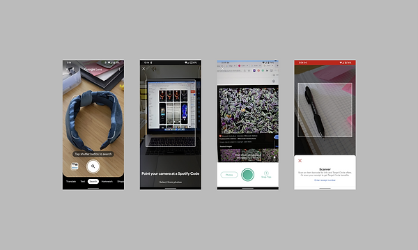
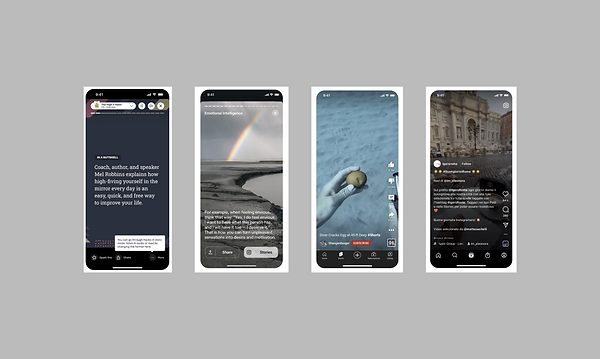
LIGHTNING DEMOS
I looked at several apps to study their structure, patterns, and elements.
Scan Image
Some apps are image/barcode/QR scanning apps, and I wanted to see some existing ways for users to scan an image to get more information.
Display Content
I researched some apps that do an excellent job of presenting information in bite-sized pieces. I looked at apps with ‘stories’ for best practices and to study some common elements.
Combining these two UX patterns seemed the simplest way to help users get the information they wanted.
I poured myself a cup of tea and embarked on a sketching exercise called crazy 8s. For this exercise, I looked at creating variations of the two critical screens in the app — the scan screen and the information screen. Since the gallery is moving away from a QR code-based system, I decided that it would be could to have a quick walkthrough at the time of app launch so that the users know what to do.

Once I had my napkin sketches, it was time to evaluate and select the screens with the most potential and refine them for further clarity.

I evaluated my app screens based on where they would feature within the user journey to identify any missing steps.

DESIGNS AND PROTOTYPE
On the fourth day of the design challenge, I faced the daunting task of creating low-fidelity screens and using them to build a prototype. I knew from my previous project that I would have to manage time efficiently and let go of my need for perfection so I could finish on time.
Based on the brief, I have designed a product keeping the principle that less is more. I played around with transparency and minimalism, so the screens look like an additional ‘layer’ to the museum experience. The app becomes an accessory to enhance the art viewing experience rather than drawing the viewer’s attention away from the artwork.

TESTING AND FEEDBACK
Even the simplest products need additional guidance, sometimes
After designing the most critical screens and prototyping them, it was time to get feedback from potential users. I reached out to museum-goers between the ages of 25 - 45 via Slack and FB groups. All participants regularly use mobile apps and have downloaded an app in the last year. Participants did not receive any incentives to perform this test.
I gave participants an overview of the product and the task at hand. Then, I asked the participants to launch the app and 'scan an artwork' to find more information about it.
-
All five participants could launch the app and knew what to do and where to click to scan the artwork.
-
All participants understood the 'Found Artwork' screen and were clear about what they had to do next.
-
2/5 participants hesitated at the 'Story' screen. They knew by the progress bar that they could move ahead but weren't sure if they should tap or swipe to go to the next screen.
Overall, I received positive feedback on the app's design and experience, with no significant changes to the flow or structure of the app.
Based on the feedback from the usability tests, I added an in-app tutorial to prompt users to tap to proceed to the next 'story.' While making this change, I also refined the UI to make the app look more on-brand.
Here are the final app screens and prototype.

GalleryPal Mobile App - Prototype
REFLECTIONS
Constraints lead to creative solutions
The Google Ventures design sprint framework is a fantastic way for individuals and teams to focus their energies on prioritizing and solving challenges they face. Using this framework for this challenge was eye-opening for me — I was amazed at how efficiently I could analyze a problem, ideate solutions, and test these solutions with users. I can't wait to use this framework in a team setting to leverage the knowledge and skills of more than one person.
Another big realization for me was that, as a designer, I am often tempted to keep reiterating designs until I achieve a level of perfection that I am satisfied with. This can lead to scope creep, which can be time-consuming and throw you off your project goals and timelines. Using this lean framework allowed me to work on balancing my need for perfection with sticking to project timelines and getting work done.